

Before today, figuring out "why did failure rates spike after my last deploy?" meant clicking through individual runs, doing the math in a spreadsheet, or building your own analytics on top of the API. Most teams just... didn't.
Now you can ask in plain English. "What are my most expensive runs?" "What's the p95 duration for my chat task?" "Which tasks are failing the most?" The AI assistant generates the TRQL query, runs it against your data, and shows you the answer.
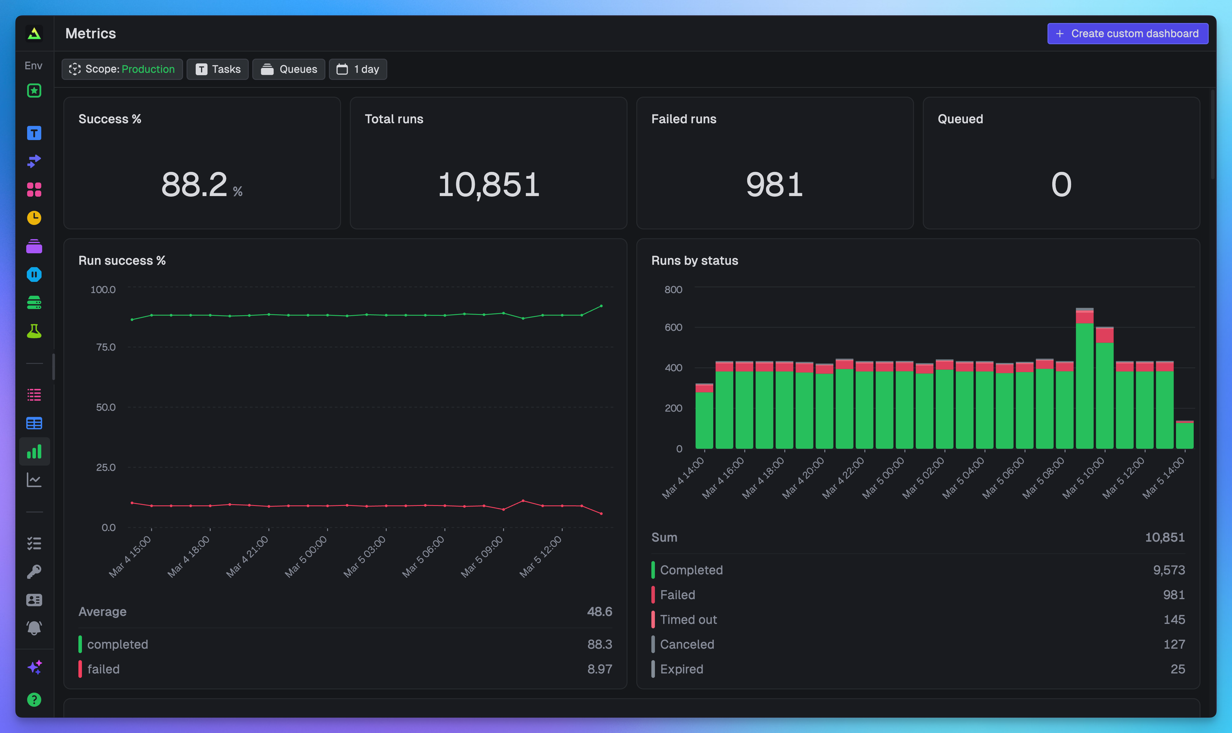
Every project ships with a pre-built dashboard. You don't have to write a single query to get started.
“We saw the metrics this morning and were kinda amazed.”

Query your data with TRQL
Everything in Query and Dashboards is powered by TRQL (Trigger Query Language), a SQL-style language that compiles to ClickHouse for fast analytical queries. If you've written SQL before, TRQL will feel familiar.
There are two tables you can query:
runs: status, timing, costs, machine type, tags, and metadata for every task runmetrics: CPU utilization, memory usage, and any custom metrics you record via OpenTelemetry
Here's an example that finds the most expensive tasks and their failure rates:
SELECT task_identifier, COUNT(*) as total_runs, SUM(total_cost) as cost, round(countIf(status = 'Failed') / COUNT(*) * 100, 2) as failure_pctFROM runsGROUP BY task_identifierORDER BY cost DESC
TRQL also includes built-in functions like timeBucket() for time-series aggregation and quantile() for percentile calculations. See the full schema and function reference and our deep-dive into how TRQL works for more detail.
Write queries in plain English
You don't need to memorize the schema. We built an AI assistant right into the dashboard that knows the structure of your data and the rules of TRQL. Just describe what you want to see:
What are the most expensive runs with their compute time, machine and task?

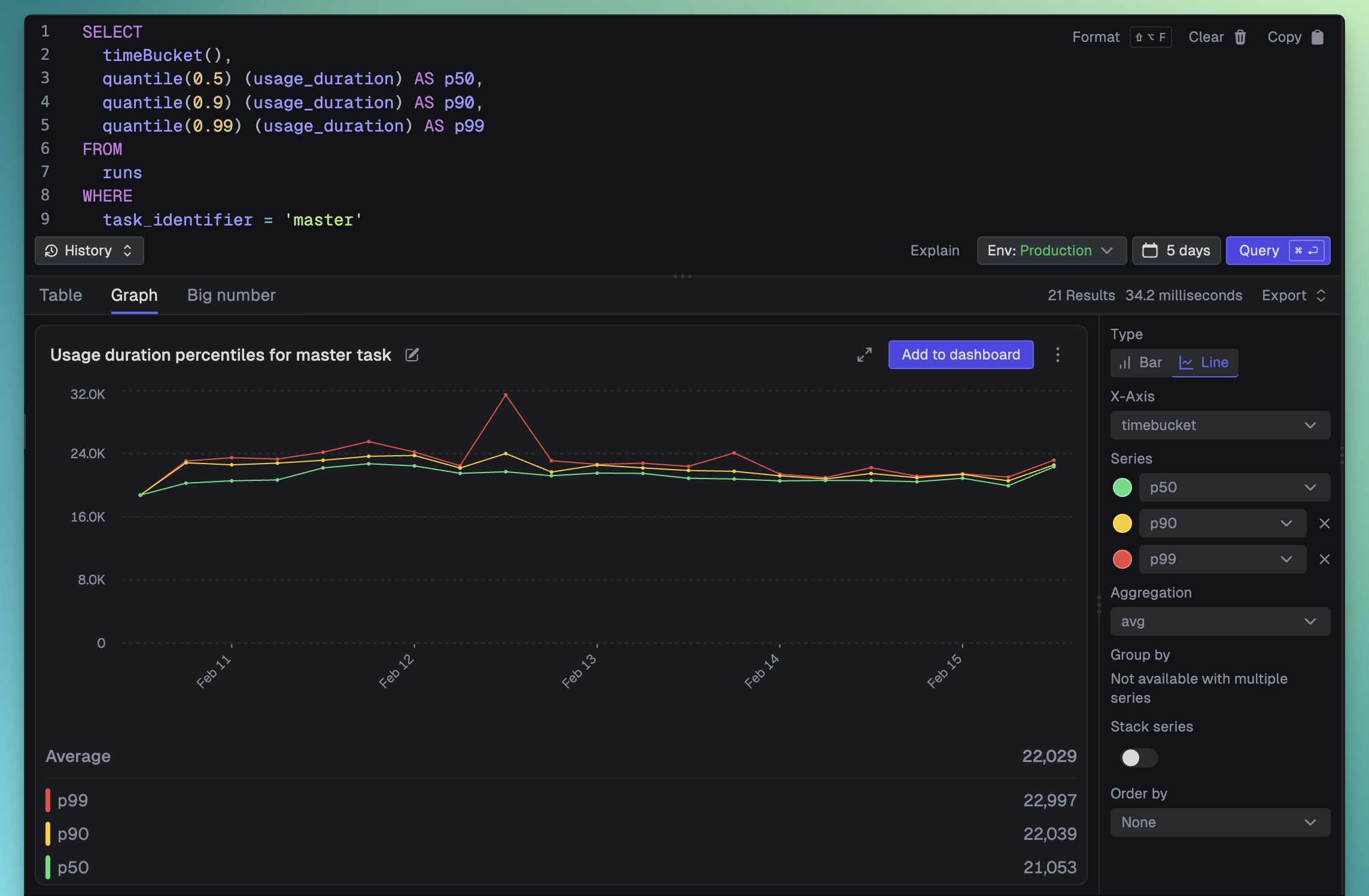
What are the p50, p90 and p99 usage durations over time for the "master" task?
The assistant handles cost analysis, error breakdowns, duration percentiles, and more. If a generated query fails, there's a "Try fix error" button that will diagnose and correct it for you.
A built-in dashboard for your project
You don't even need to write your first query. Every project comes with a pre-configured dashboard that gives you an overview of your most important data. Just open it and start monitoring.
It includes:
- Run volume: Total runs, queued runs, and run status breakdown
- Success rates: Overall success percentage and trends over time
- Failures: Failed run counts, failure rates by task, and top errors
- Costs: Total costs broken down by task and machine type
- Versions: Run counts and success rates by deployment version
Build custom dashboards tailored to your workflow
The built-in dashboard is a great starting point, but you'll quickly want dashboards tailored to your specific needs. Custom dashboards are fully editable and support three types of widgets.
Big numbers: at-a-glance KPIs
The fastest way to know if something needs your attention. Big number widgets display a single value. Total cost, success rate, queue depth – whatever matters most to you right now.
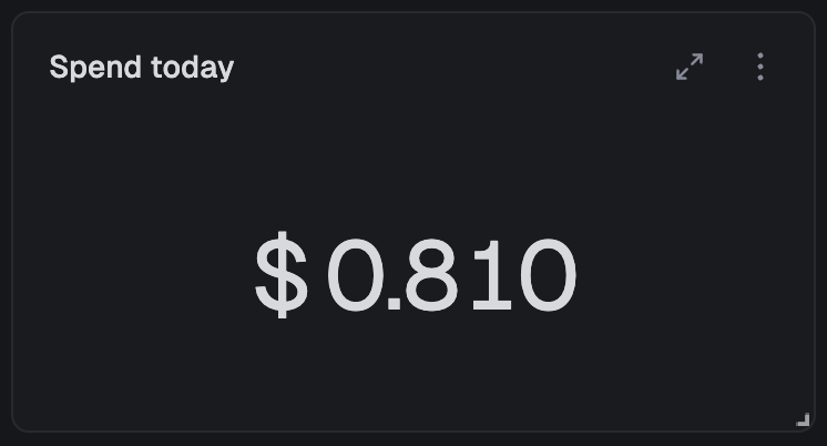
The query behind this widget:
SELECT SUM(total_cost) as total_costFROM runs
Configure how the number displays: abbreviate large values (1.2M instead of 1,234,567), add prefixes like "$" or suffixes like "%", and choose how to aggregate (sum, average, min, max, first, last) if there are multiple rows.
Charts: trends and distributions over time
This is where things get interesting. Visualize your data with bar, stacked bar, line, and area charts. You can spot patterns that are invisible in raw numbers.

The query behind this chart:
SELECT timeBucket(), quantile(0.5)(usage_duration) as p50, quantile(0.9)(usage_duration) as p90, quantile(0.99)(usage_duration) as p99FROM runsWHERE task_identifier = 'process-video'GROUP BY timeBucketORDER BY timeBucket
Charts automatically handle time-series data, zero-filling missing time intervals. The timeBucket() function intelligently bins your data based on the selected time period: 1 min buckets for the last hour, 15 min buckets for 24 hours, 1 hr buckets for 7 days, and so on. No manual bucket size configuration needed.
You can add multiple series to plot more lines, or use "Group by" to automatically split data with color coding. Grouping works with stacked bar charts and area charts too.
Tables: detailed breakdowns
When you need to dig into the specifics (which tasks are failing, what's costing the most, where retries are piling up) tables give you sortable, detailed data.
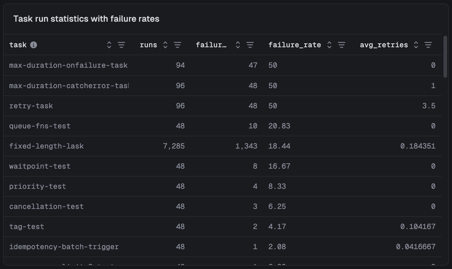
The query behind this table:
SELECT task_identifier as task, COUNT(*) as runs, countIf(status IN ('Failed', 'Crashed', 'System failure')) as failures, round((countIf(status IN ('Failed', 'Crashed', 'System failure')) / COUNT()) * 100, 2) as failure_rate, avg(attempt_count - 1) as avg_retriesFROM runsGROUP BY task_identifierORDER BY failure_rate DESC
You can quickly reorder columns and filter the table by any column.
Arrange it your way
Organize your dashboard exactly how you want it. Widgets can be dragged to re-order them and resized from the bottom-right corner, snapping to a 12-column grid. You can also add title widgets to create sections.
All layout changes save automatically.
Filter everything at once
Every dashboard supports real-time filtering without editing individual queries:
- Time: Select from presets (1h, 24h, 7d, 30d) or choose custom date ranges
- Task: Focus on specific tasks or compare groups of tasks
- Queue: Analyze concurrency and performance across different queues
- Scope: View metrics at environment, project, or organization level
All filters apply to every widget on the dashboard simultaneously.
Dashboards automatically refresh every 60 seconds, keeping your metrics current.
Query from your code
Dashboards are great for humans, but your code should be able to perform queries too. Build custom views for your users, power internal dashboards, or let AI coding agents query your task data to help debug issues.
Show data to your users
Use our query.execute SDK function to build query-powered views directly into your product:
import { query } from "@trigger.dev/sdk";const results = await query.execute<{ task_identifier: string; count: number }>( `SELECT task_identifier, COUNT(*) as count FROM runs GROUP BY task_identifier`);for (const row of results.rows) { console.log(`${row.task_identifier}: ${row.count} runs`);}
We include a QueryTable type so you get type-safe column access and autocomplete based on the table schema and the columns you select:
const recentRuns = await query.execute<QueryTable<"runs", "run_id" | "status">>( "SELECT run_id, status FROM runs", { period: "1h", });console.log(recentRuns.rows[0].status);
REST API
The REST API lets you integrate query data into monitoring tools, feed results to AI coding agents for debugging, or power custom alerting:
curl -X POST https://api.trigger.dev/api/v1/query \ -H "Authorization: Bearer YOUR_API_KEY" \ -H "Content-Type: application/json" \ -d '{ "query": "SELECT task_identifier, COUNT(*) as count FROM runs GROUP BY task_identifier" }'
{ "format": "json", "results": [ { "task_identifier": "ai-generate-video", "count": 764921 }, { "task_identifier": "process-assets", "count": 2982131 } ]}
Get started
No more clicking through individual runs to understand what's happening. Query and Dashboards are available now for all users, and every project already has a built-in dashboard waiting for you.
- Query documentation
- Query API reference
- Dashboards documentation
- How TRQL works under the hood: the architecture behind Query
Head to your Trigger.dev dashboard to try it out, and let us know what you build.